
8. Statistics and data analysis
In this lesson, we are going to build on our first steps with pandas in the previous and learn how it can be used to efficiently handle large datasets.
We will work on some real world data to show pandas, scipy and matplotlib are applied. A caveat to begin with, though: all these libraries are tools that help you get stuff done more easily and quickly. Like any tool, they can be used completely wrong. For example, you can apply many different statistical tests in a single line of code using scipy.stats, but nobody stops you from using a test that isn’t the correct one for your data. That is on you. To be honest, I am not 100% sure if all the things I am doing in this section are 100% sound. Some of it is definitely outside my area of expertise. If you find a mistake, please let me know and I will correct ASAP.
import matplotlib.pyplot as plt
import pandas as pd
import numpy as np

%matplotlib inline
8.1. Statistical descriptors and statistical testing
In our first example, we have a dataset of different methods for determination of CO2 mass percent in a anhydrous sodium carbonate sample. We will determine the confidence interval of each method and see which one of them is the most precise and accurate. The raw data looks like this:
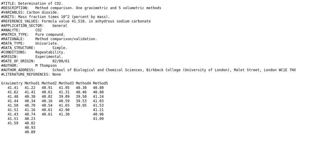
Step one: load data into pandas.DataFrame. Delimiters are arbitrary numbers of spaces. And there are a few skipped lines and a header. To use arbitrary white space as delimiter in pandas, we use the delim_whitespace optional argument. (Reminder: if you don’t know what arguments to pass to a function, just read the documentation):
CO2_df = pd.read_csv("data/CO2_methods_tcm18-57755.txt",
                     skiprows=18,
                    delim_whitespace=True)
CO2_df
| Gravimetry | Method1 | Method2 | Method3 | Method4 | Method5 | |
|---|---|---|---|---|---|---|
| 0 | 41.41 | 41.22 | 40.91 | 41.95 | 40.30 | 40.80 |
| 1 | 41.62 | 41.41 | 40.61 | 41.31 | 40.46 | 40.88 |
| 2 | 41.48 | 40.30 | 40.02 | 39.09 | 39.50 | 41.24 |
| 3 | 41.44 | 40.34 | 40.16 | 40.59 | 39.53 | 41.03 |
| 4 | 41.50 | 40.70 | 40.54 | 41.65 | 39.95 | 41.53 |
| 5 | 41.51 | 41.16 | 40.61 | 42.90 | 41.21 | NaN |
| 6 | 41.43 | 40.74 | 40.61 | 41.30 | 40.96 | NaN |
| 7 | 41.51 | 40.23 | 41.09 | NaN | NaN | NaN |
| 8 | 41.59 | 40.82 | NaN | NaN | NaN | NaN |
| 9 | 40.93 | NaN | NaN | NaN | NaN | NaN |
| 10 | 40.89 | NaN | NaN | NaN | NaN | NaN |
The nice printout of the data frame shows us that things - again - don’t work right away. It seems, that consecutive runs of spaces were stripped until the first number was reached and then that number was put into the first column. After reading all the options for read_csv, it turns out there might not be a good way to configure the function to import the dataset, because we are in fact not looking at at delimited format but at a “fixed width” format. These have the same number of characters for each column or at least a constant number for each column across all lines. Superfluous characters are filled with spaces. A quick internet search for “open fixed width format pandas” points us to the read_fwf function.
The reason I am including this circuitous route to loading the data is, that getting a dataset into a shape that we can work with is often one of the harder parts of a new project. A lot of things can go wrong at this point and lack of documentation and standards make it hard to come up with a one size fits all solution. The only thing to do is to be cautious, check and recheck if what you think you loaded is actually what python loaded and try all the tools that panda, numpy, scipy or third party projects make available to you.
Using the more adept function, we get the following:
CO2_df = pd.read_fwf("data/CO2_methods_tcm18-57755.txt",
                     skiprows=18)
CO2_df
| Gravimetry | Method1 | Method2 | Method3 | Method4 | Method5 | |
|---|---|---|---|---|---|---|
| 0 | 41.41 | 41.22 | 40.91 | 41.95 | 40.30 | 40.80 |
| 1 | 41.62 | 41.41 | 40.61 | 41.31 | 40.46 | 40.88 |
| 2 | 41.48 | 40.30 | 40.02 | 39.09 | 39.50 | 41.24 |
| 3 | 41.44 | 40.34 | 40.16 | 40.59 | 39.53 | 41.03 |
| 4 | 41.50 | 40.70 | 40.54 | 41.65 | 39.95 | 41.53 |
| 5 | 41.51 | 41.16 | 40.61 | 42.90 | NaN | 41.21 |
| 6 | 41.43 | 40.74 | 40.61 | 41.30 | NaN | 40.96 |
| 7 | 41.51 | 40.23 | NaN | NaN | NaN | 41.09 |
| 8 | 41.59 | 40.82 | NaN | NaN | NaN | NaN |
| 9 | NaN | 40.93 | NaN | NaN | NaN | NaN |
| 10 | NaN | 40.89 | NaN | NaN | NaN | NaN |
To determine mean and standard deviation, we can use methods .mean() and .std() of the dataframe.
CO2_df.mean()
Gravimetry    41.498889
Method1       40.794545
Method2       40.494286
Method3       41.255714
Method4       39.948000
Method5       41.092500
dtype: float64
CO2_df.std()
Gravimetry    0.070435
Method1       0.387721
Method2       0.303252
Method3       1.188807
Method4       0.436314
Method5       0.232732
dtype: float64
To check if our methods are accurate we will use a one-sample t test to evaluate if the true value of 41.518% mass of CO2 is significantly different from the mean measurement results for each method.
CO2_true_value = 41.518
The one sample t-test is called ttest_1samp in scipy.stats:
from scipy.stats import ttest_1samp
We need to apply it to each columns of our dataframe separately. We will do this using the .apply method. We also need to set some of the arguments to set the mean value to test and tell ttest_1samp how to handle nans. We will use a lambda function to wrap ttest_1samp and set those arguments.
Note
lambda functions were introduced in the second set of exercises. In case you haven’t done them yet, I will briefly summarize lambda functions.
lambda functions are a way to define inline functions. Their syntax is the keyword lambda followed by the argument names and a colon. Following the colon is a single python statement - the functions body. The return value of the function is whatever the single statement evaluates to. lambda functions don’t have name and are not kept around unless they are stored in a variable.
CO2_df.apply(lambda col: ttest_1samp(col,
                                     popmean=CO2_true_value,
                                     nan_policy="omit").pvalue)
Gravimetry    0.439207
Method1       0.000103
Method2       0.000110
Method3       0.580667
Method4       0.001295
Method5       0.001293
dtype: float64
The series we just calculated contains p-values for the t-test by column. To see if the mean of the sampled distributions of measurement values is significantly different from the true value of mass% of CO2 we have to compare p-values to the \(\alpha\) (e.g. 0.05). We have to reject the Null hypothesis (the mean of the distribution is equal to the true value) for all \(p < \alpha\)
accurate = CO2_df.apply(lambda col: ttest_1samp(col,
                                     popmean=CO2_true_value,
                                     nan_policy="omit").pvalue)>0.05
accurate
Gravimetry     True
Method1       False
Method2       False
Method3        True
Method4       False
Method5       False
dtype: bool
Only Gravimetry and Method3 do not show bias.
Because it doesn’t make much sense to calculate confidence intervals for methods that we now know are accurate, we will create a new dataset that only contains accurate methods (using boolean indexing).
Hint
Remember: For boolean indexing, we create a series, dataframe or numpy array full of boolean values and use it together with the indexing square brackets syntax [] to select rows. This will select all elements where the boolean array was true. We can also use boolean indexing with .loc in pandas to select columns, by replacing the first argument with a colon.
The resulting dataframe we are creating below only contains methods which we consider accurate:
CO2_df_accurate =  CO2_df.loc[:,accurate]
CO2_df_accurate
| Gravimetry | Method3 | |
|---|---|---|
| 0 | 41.41 | 41.95 |
| 1 | 41.62 | 41.31 |
| 2 | 41.48 | 39.09 |
| 3 | 41.44 | 40.59 |
| 4 | 41.50 | 41.65 |
| 5 | 41.51 | 42.90 |
| 6 | 41.43 | 41.30 |
| 7 | 41.51 | NaN |
| 8 | 41.59 | NaN |
| 9 | NaN | NaN |
| 10 | NaN | NaN |
Since there was a different number of measurements for each method, we can’t compare the standard deviations directly to determine which method is more precise. Instead, we will use the confidence intervals, using the 95% confidence interval. The formula for the confidence interval data with empirical standard deviation is:
with \(\bar{x}\) being the empirical mean, \(s\) the empirical standard deviation and \(n\) being the number of samples, \(\alpha\) is the confidence level subtracted from 1.
The quantile values of t are provided by t.ppf() from the scipy scipy.stats package.
from scipy.stats import t

t.ppf(1-0.05/2, 3)
3.182446305284263
Since \(n\), \(s\) and \(\bar{x}\) vary from one method to the next, we need to be careful not to mix up data. This is were pandas really shines: all we need to know is, that the number of non-nan values in each column is determined using the .count() method, and we can just fill in the values in the above formula:
n = CO2_df_accurate.count()
s = CO2_df_accurate.std()

conf_int = t.ppf(1-0.05/2, n-1) *s/np.sqrt(n)
conf_int
Gravimetry    0.054141
Method3       1.099463
dtype: float64
We can either create a new dataframe that we put the values we just created into or we create a dictionary that has the new column names as key and the Series objects that were the results from our calculation as items.
CO2_conf_int = pd.DataFrame(
    {"mean":CO2_df_accurate.mean(),
     "confidence interval (95%)":conf_int})
CO2_conf_int
| mean | confidence interval (95%) | |
|---|---|---|
| Gravimetry | 41.498889 | 0.054141 |
| Method3 | 41.255714 | 1.099463 |
Alternatively, we can also create a function calc_conf_int that calculates the confidence interval given a column as input, like so:
def calc_conf_int(col):
    n = col.count()
    s = col.std()
    return t.ppf(1-0.05/2, n-1) *s/np.sqrt(n)
And then use that function together with the .agg method of our dataframe. As you can see the result is a dataframe that has “mean” as the name of the first row and “calc_conf_int” as name of the second row. We can .rename and transpose the dataframe to make it looks nicer:
CO2_df_accurate.agg(func=["mean",calc_conf_int])
| Gravimetry | Method3 | |
|---|---|---|
| mean | 41.498889 | 41.255714 |
| calc_conf_int | 0.054141 | 1.099463 |
CO2_conf_int = CO2_df_accurate.agg(func=["mean",calc_conf_int])\
      .rename({"calc_conf_int": "confidence interval"}).T
CO2_conf_int
| mean | confidence interval | |
|---|---|---|
| Gravimetry | 41.498889 | 0.054141 |
| Method3 | 41.255714 | 1.099463 |
Note
Our changes are only stored when we assign the result of in another variable! If we don’t do that, they are displayed, if they are the last statement in a cell, otherwise they are just discarded.
8.2. Larger datasets
You could have done most of these steps pretty easily by hand as well. However, the neat thing about using a programming language is that things scale. It doesn’t make much of difference if you look a 10 values, 100 values or 1000 values (in most cases).
Our next dataset is similar to this one, but much larger. A reference material for river sediment was measured 567 times using ICP-AES by different operators. These measurements were performed in 158 runs with multiple repeat measurement for each run. For each measurement, the mass fraction in ppb of the following elements was determined:
Li Na K Rb Be Mg Ca Sr Ba Al La Ti V Cr Mo Mn Fe Co Ni Cu Ag Zn Cd Pb P
ICP_df = pd.read_csv("data/AGRG_IQC_text_tcm18-57754.txt",
                     skiprows=17,
                    delimiter="\t")
ICP_df
| Run | Repeat | Li | Na | K | Rb | Be | Mg | Ca | Sr | ... | Mn | Fe | Co | Ni | Cu | Ag | Zn | Cd | Pb | P | |
|---|---|---|---|---|---|---|---|---|---|---|---|---|---|---|---|---|---|---|---|---|---|
| 0 | 1 | 1 | 141.79 | 959.88 | 8404 | 112.08 | 2.87 | 13018 | 5957 | 1337 | ... | 1506.0 | 47564 | 49.57 | 255.22 | 610.57 | 1.85 | 377.36 | 3.09 | 486.24 | 628.61 |
| 1 | 1 | 2 | 140.38 | 993.00 | 8449 | 114.84 | 2.62 | 12897 | 5903 | 1341 | ... | 1509.0 | 47756 | 49.89 | 254.45 | 623.80 | 1.45 | 368.19 | 2.97 | 508.57 | 653.63 |
| 2 | 1 | 3 | 146.57 | 1041.38 | 8698 | 115.42 | 2.82 | 13515 | 6212 | 1416 | ... | 1289.0 | 48593 | 50.22 | 259.38 | 608.73 | 2.12 | 373.46 | 2.98 | 498.67 | 660.90 |
| 3 | 1 | 4 | 134.88 | 905.84 | 8003 | 111.40 | 2.58 | 12867 | 5724 | 1352 | ... | 1510.0 | 48072 | 49.65 | 250.47 | 599.31 | 1.38 | 374.76 | 2.98 | 500.60 | 645.38 |
| 4 | 1 | 5 | 137.74 | 942.90 | 8420 | 112.95 | 2.64 | 12964 | 5849 | 1341 | ... | 1383.0 | 47816 | 48.95 | 248.25 | 605.27 | 1.34 | 377.83 | 3.11 | 490.17 | 637.00 |
| ... | ... | ... | ... | ... | ... | ... | ... | ... | ... | ... | ... | ... | ... | ... | ... | ... | ... | ... | ... | ... | ... |
| 544 | 157 | 4 | 148.33 | 722.74 | 8283 | 118.65 | 2.70 | 13394 | 5861 | 1357 | ... | 1515.0 | 46018 | 49.82 | 260.33 | 616.19 | 2.67 | 400.96 | 3.22 | 508.44 | 684.66 |
| 545 | 157 | 5 | 140.34 | 633.68 | 7264 | 111.46 | 2.42 | 12657 | 5447 | 1390 | ... | 1491.0 | 45980 | 49.69 | 259.45 | 598.30 | 1.37 | 388.16 | 3.08 | 514.81 | 673.99 |
| 546 | 158 | 1 | 154.20 | 722.83 | 8188 | 120.17 | 2.71 | 13400 | 5925 | 1337 | ... | 1507.0 | 44841 | 48.79 | 254.08 | 585.29 | 1.90 | 373.68 | 3.26 | 504.62 | 662.64 |
| 547 | 158 | 2 | 155.47 | 722.67 | 8223 | 118.49 | 2.78 | 13340 | 5912 | 1327 | ... | 1474.0 | 45480 | 49.13 | 258.21 | 609.92 | 1.82 | 381.53 | 3.12 | 500.19 | 698.16 |
| 548 | 158 | 3 | 149.98 | 699.24 | 7954 | 118.61 | 2.60 | 13078 | 5757 | 1317 | ... | 1490.0 | 44474 | 48.29 | 251.96 | 582.67 | 1.90 | 375.02 | 3.17 | 484.03 | 655.28 |
549 rows × 27 columns
There are two values missing, as we can see by count()ing the values in each column:
ICP_df.count()
Run       549
Repeat    549
Li        549
Na        549
K         549
Rb        549
Be        549
Mg        549
Ca        549
Sr        549
Ba        549
Al        549
La        549
Ti        549
V         549
Cr        548
Mo        549
Mn        548
Fe        549
Co        549
Ni        549
Cu        549
Ag        549
Zn        549
Cd        549
Pb        549
P         549
dtype: int64
8.2.1. Visualization
Let’s have a look at the trend of the dataset using matplotlib again. We can index columns from the dataframe by using the [] indexing syntax and the column name. To get “Run” columns, we would type ICP_df["Runs"]
fig_raw = plt.figure()
ax_raw = fig_raw.add_subplot()
ax_raw.plot(ICP_df["Run"], ICP_df["Fe"])
ax_raw.set_xlabel("Run")
ax_raw.set_ylabel("Fe / ppb")
Text(0, 0.5, 'Fe / ppb')

To get an idea of overall trends, we would like to plot all measured elements in a single axes.
To do this in the least amount of lines, we will first get a list of all columns and remove “Run” and “Repeat”. Then iterate over all remaining columns:
elements = list(ICP_df.columns)
elements.remove("Run")
elements.remove("Repeat")
print(elements)
['Li', 'Na', 'K', 'Rb', 'Be', 'Mg', 'Ca', 'Sr', 'Ba', 'Al', 'La', 'Ti', 'V', 'Cr', 'Mo', 'Mn', 'Fe', 'Co', 'Ni', 'Cu', 'Ag', 'Zn', 'Cd', 'Pb', 'P']
fig_raw = plt.figure()
ax_raw = fig_raw.add_subplot()
for element in elements:
    ax_raw.plot(ICP_df["Run"],
                ICP_df[element],
               label=element)
ax_raw.set_xlabel("Run")
ax_raw.set_ylabel("concentration / ppb")
ax_raw.legend(ncol=5)
<matplotlib.legend.Legend at 0x7f1a897758e0>

We will normalize to the mean concentration for each element to make the trends a bit clearer:
fig_raw = plt.figure()
ax_raw = fig_raw.add_subplot()
for element in elements:
    ax_raw.plot(ICP_df["Run"],
                ICP_df[element]/ICP_df[element].mean(),
               label=element)
ax_raw.set_xlabel("Run")
ax_raw.set_ylabel("concentration (normalized) / 1")
ax_raw.legend(ncol=5)
<matplotlib.legend.Legend at 0x7f1a8962f760>

Still, this is a bit hard to understand. Especially, because
we run out of colors. It would be better if we had one axis per element instead. We will use the .suplots method to create multiple plots and link their x axes together. Then we loop over all elements and plot one per axis.
We will make our figure a bit higher to accommodate the additional axes. .subplots asks us how many rows and columns of plots we want. We want one per element, so len(elements). Setting sharex=True makes all x axes automatically have the same size and scale. The return value of .subplots() is an array of subplots that we store in axes_raw.
In the for loop, we use the enumerate function, to turn the list of elements into a list of tuples (<idx>, <element>). We then use the idx to select a subplot from axes_raw to plot into.
The plotting command itself stays the same, but we will add an annotation stating the element in the top right corner of each axes and then adjust the layout a bit to remove space between plots.
fig_raw = plt.figure(figsize=(3,21))
axes_raw = fig_raw.subplots(nrows=len(elements),
                           sharex=True)

for idx, element in enumerate(elements):
    cur_ax = axes_raw[idx]
    cur_ax.plot(ICP_df["Run"],
                ICP_df[element],
               label=element)
    cur_ax.annotate(element,
                   xy=(0.01,.99),
                   xycoords="axes fraction",
                   ha="left",
                   va="top")
fig_raw.subplots_adjust(hspace=0)

axes_raw[-1].set_xlabel("Run");

8.2.2. GroupBy and Aggregate
Since there were repeated determinations done for the runs, it might be a better idea to look at mean values per run rather than single measurement results. So, we would like to generate a dataframe that contains the average value per run (using the run as row index, and the element as column index): Luckily, that is a two-liner using pandas .groupby and .agg. First, we group rows by the “Run” column and then .aggregate using the mean.
ICP_mean = ICP_df.groupby("Run").agg("mean")
ICP_mean
| Repeat | Li | Na | K | Rb | Be | Mg | Ca | Sr | Ba | ... | Mn | Fe | Co | Ni | Cu | Ag | Zn | Cd | Pb | P | |
|---|---|---|---|---|---|---|---|---|---|---|---|---|---|---|---|---|---|---|---|---|---|
| Run | |||||||||||||||||||||
| 1 | 4.5 | 138.750000 | 939.130000 | 8230.125000 | 112.54625 | 2.656250 | 12923.000000 | 5827.000000 | 1360.00 | 333.563750 | ... | 1448.250000 | 47810.500000 | 49.701250 | 253.60375 | 611.275000 | 1.508750 | 371.230000 | 3.015000 | 497.9975 | 637.275000 |
| 2 | 2.5 | 143.780000 | 959.020000 | 8198.500000 | 115.40000 | 2.742500 | 13118.750000 | 5952.500000 | 1376.00 | 265.492500 | ... | 1416.500000 | 48557.500000 | 50.190000 | 254.08250 | 612.800000 | 1.415000 | 373.092500 | 2.610000 | 504.4800 | 653.990000 |
| 3 | 3.0 | 133.216000 | 953.130000 | 8262.000000 | 110.50400 | 2.774000 | 13075.800000 | 6097.800000 | 1291.80 | 422.724000 | ... | 1433.600000 | 46936.800000 | 48.292000 | 247.87000 | 569.756000 | 1.426000 | 364.458000 | 2.198000 | 487.5020 | 611.372000 |
| 4 | 3.0 | 132.068000 | 931.456000 | 8246.000000 | 122.46600 | 2.714000 | 12930.400000 | 5962.400000 | 1299.60 | 261.926000 | ... | 1452.600000 | 47100.800000 | 48.446000 | 246.61200 | 561.380000 | 1.120000 | 364.884000 | 2.574000 | 490.8980 | 620.150000 |
| 5 | 3.0 | 132.680000 | 936.452000 | 8285.800000 | 112.39000 | 2.722000 | 12923.400000 | 5977.200000 | 1302.40 | 242.444000 | ... | 1367.600000 | 46887.400000 | 48.178000 | 245.82000 | 578.130000 | 0.900000 | 361.098000 | 2.400000 | 485.1960 | 620.208000 |
| ... | ... | ... | ... | ... | ... | ... | ... | ... | ... | ... | ... | ... | ... | ... | ... | ... | ... | ... | ... | ... | ... |
| 154 | 1.0 | 148.430000 | 706.840000 | 7847.000000 | 114.04000 | 2.730000 | 13245.000000 | 5839.000000 | 1342.00 | 283.720000 | ... | 1401.000000 | 45407.000000 | 48.720000 | 258.61000 | 588.470000 | 1.940000 | 371.870000 | 2.890000 | 491.5000 | 673.950000 |
| 155 | 1.5 | 154.265000 | 688.745000 | 7912.000000 | 111.89000 | 2.760000 | 13586.500000 | 5901.500000 | 1395.00 | 300.815000 | ... | 1535.500000 | 48812.000000 | 52.220000 | 272.81000 | 630.100000 | 1.685000 | 413.475000 | 2.990000 | 549.1100 | 714.940000 |
| 156 | 2.5 | 151.347500 | 713.305000 | 8047.000000 | 117.02750 | 2.612500 | 13165.750000 | 5748.750000 | 1341.75 | 297.422500 | ... | 1507.500000 | 45401.500000 | 48.882500 | 255.83500 | 590.567500 | 1.722500 | 379.430000 | 3.190000 | 492.3750 | 703.662500 |
| 157 | 3.0 | 143.922000 | 677.020000 | 7800.800000 | 115.32400 | 2.580000 | 13064.200000 | 5625.800000 | 1357.20 | 342.344000 | ... | 1512.400000 | 45972.200000 | 49.872000 | 259.85200 | 606.158000 | 1.754000 | 389.310000 | 3.128000 | 506.8940 | 685.532000 |
| 158 | 2.0 | 153.216667 | 714.913333 | 8121.666667 | 119.09000 | 2.696667 | 13272.666667 | 5864.666667 | 1327.00 | 355.303333 | ... | 1490.333333 | 44931.666667 | 48.736667 | 254.75000 | 592.626667 | 1.873333 | 376.743333 | 3.183333 | 496.2800 | 672.026667 |
158 rows × 26 columns
We can also plot the mean values on top of the raw data to get an idea if the intra run deviation is similar to the inter run deviation. We just take our previous code, and add a second plot command in the loop, the takes values from the dataframe of means.
Since the index of that dataframe is now the “Run”, we need to use ICP_mean.index for the x in the .plot method:
fig_raw = plt.figure(figsize=(3,21))
axes_raw = fig_raw.subplots(nrows=len(elements),
                           sharex=True)

for idx, element in enumerate(elements):
    cur_ax = axes_raw[idx]
    cur_ax.plot(ICP_df["Run"],
                ICP_df[element],
               label=element)
    # plotting means
    cur_ax.plot(ICP_mean.index,
               ICP_mean[element],
               label=element)
    cur_ax.annotate(element,
                   xy=(0.01,.99),
                   xycoords="axes fraction",
                   ha="left",
                   va="top")
fig_raw.subplots_adjust(hspace=0)

axes_raw[-1].set_xlabel("Run");

For some elements, the scatter of the data is definitely improved by averaging per run, while for others like Ba not so much.
A good indication for bad run might still be, that it has a low precision. We would like to do a comparison of the standard deviations of each run per element. Again, we will use .groupby and then .agg. This time with “std”.
ICP_std = ICP_df.groupby("Run").agg("std")
ICP_std
| Repeat | Li | Na | K | Rb | Be | Mg | Ca | Sr | Ba | ... | Mn | Fe | Co | Ni | Cu | Ag | Zn | Cd | Pb | P | |
|---|---|---|---|---|---|---|---|---|---|---|---|---|---|---|---|---|---|---|---|---|---|
| Run | |||||||||||||||||||||
| 1 | 2.449490 | 4.026090 | 59.458209 | 346.343528 | 2.940199 | 0.127272 | 273.607122 | 206.067950 | 29.466688 | 21.009485 | ... | 93.721091 | 438.288881 | 0.417217 | 3.537473 | 8.126521 | 0.324629 | 5.304316 | 0.125471 | 11.391177 | 16.443492 |
| 2 | 1.290994 | 2.429691 | 24.384602 | 315.417712 | 4.373869 | 0.141274 | 344.630599 | 218.116941 | 36.742346 | 2.289736 | ... | 152.220235 | 1306.415580 | 0.733757 | 3.918600 | 23.036792 | 0.268887 | 9.684559 | 0.111654 | 8.688084 | 13.528784 |
| 3 | 1.581139 | 5.015469 | 14.960002 | 171.124224 | 3.541070 | 0.088769 | 140.741607 | 71.614943 | 20.278067 | 41.389672 | ... | 118.822557 | 339.312835 | 0.723443 | 3.247176 | 13.777964 | 0.183929 | 9.877258 | 0.223540 | 9.250193 | 12.096936 |
| 4 | 1.581139 | 2.888342 | 46.223828 | 247.583319 | 24.466980 | 0.188494 | 348.530917 | 204.903148 | 24.551986 | 40.373258 | ... | 72.669113 | 363.695889 | 0.538962 | 2.741801 | 7.101310 | 0.111131 | 8.297251 | 0.190342 | 9.089674 | 12.983322 |
| 5 | 1.581139 | 1.486960 | 21.230641 | 207.486626 | 1.317877 | 0.168285 | 282.645184 | 159.772338 | 18.968395 | 14.889037 | ... | 77.632467 | 764.527174 | 0.607758 | 3.446556 | 11.697188 | 0.071764 | 8.744780 | 0.335932 | 10.003069 | 14.939912 |
| ... | ... | ... | ... | ... | ... | ... | ... | ... | ... | ... | ... | ... | ... | ... | ... | ... | ... | ... | ... | ... | ... |
| 154 | NaN | NaN | NaN | NaN | NaN | NaN | NaN | NaN | NaN | NaN | ... | NaN | NaN | NaN | NaN | NaN | NaN | NaN | NaN | NaN | NaN |
| 155 | 0.707107 | 0.035355 | 29.493424 | 352.139177 | 6.703372 | 0.098995 | 277.892965 | 191.625938 | 18.384776 | 21.771818 | ... | 12.020815 | 111.722871 | 0.098995 | 0.707107 | 8.456997 | 0.219203 | 1.364716 | 0.155563 | 3.973940 | 1.810193 |
| 156 | 1.290994 | 3.270029 | 15.893379 | 262.687393 | 1.994315 | 0.026300 | 203.116346 | 98.289962 | 13.022417 | 27.926483 | ... | 80.748581 | 406.248282 | 0.705425 | 3.065349 | 14.744731 | 0.027538 | 11.913441 | 0.069761 | 10.267530 | 36.910937 |
| 157 | 1.581139 | 4.295483 | 41.034417 | 525.634569 | 6.379822 | 0.141421 | 308.930737 | 176.217763 | 20.825465 | 39.101631 | ... | 26.149570 | 118.305537 | 0.179221 | 0.699371 | 9.022265 | 0.539843 | 8.538653 | 0.164073 | 8.817294 | 14.028139 |
| 158 | 1.000000 | 2.874062 | 13.573741 | 146.254345 | 0.937230 | 0.090738 | 171.234732 | 93.468355 | 10.000000 | 41.442044 | ... | 16.502525 | 509.091675 | 0.422532 | 3.178412 | 15.033650 | 0.046188 | 4.199171 | 0.070946 | 10.837578 | 22.929364 |
158 rows × 26 columns
If we count the result columns, we see that instead of 158 we now only have 150 to 151 filled with non-nan values.
ICP_std.count()
Repeat    151
Li        151
Na        151
K         151
Rb        151
Be        151
Mg        151
Ca        151
Sr        151
Ba        151
Al        151
La        151
Ti        151
V         151
Cr        151
Mo        151
Mn        150
Fe        151
Co        151
Ni        151
Cu        151
Ag        151
Zn        151
Cd        151
Pb        151
P         151
dtype: int64
The length of the dataframe is still 158 though:
len(ICP_std)
158
Hence, a few of our groups must unexpectedly have resulted in nans, when we tried to calculate the standard deviation. Which ones? To figure that out, we can use boolean indexing.
So, step one: create boolean array called isnan that is true wherever there are nans in a column.
And then, step two, use it to select elements from the index of ICP_std:
isnan = np.isnan(ICP_std["Repeat"])

ICP_std.index[isnan]
Int64Index([36, 86, 94, 112, 139, 149, 154], dtype='int64', name='Run')
What do these runs have in common? We can again use logical indexing to check out all rows of those run from the raw data frame.
ICP_df[ICP_df["Run"] == 36]
| Run | Repeat | Li | Na | K | Rb | Be | Mg | Ca | Sr | ... | Mn | Fe | Co | Ni | Cu | Ag | Zn | Cd | Pb | P | |
|---|---|---|---|---|---|---|---|---|---|---|---|---|---|---|---|---|---|---|---|---|---|
| 132 | 36 | 1 | 136.14 | 978.48 | 8536 | 100.02 | 2.49 | 13455 | 5931 | 1337 | ... | 1423.0 | 47359 | 48.42 | 246.05 | 585.77 | 1.92 | 355.67 | 2.16 | 477.7 | 666.96 |
1 rows × 27 columns
ICP_df[ICP_df["Run"] == 86]
| Run | Repeat | Li | Na | K | Rb | Be | Mg | Ca | Sr | ... | Mn | Fe | Co | Ni | Cu | Ag | Zn | Cd | Pb | P | |
|---|---|---|---|---|---|---|---|---|---|---|---|---|---|---|---|---|---|---|---|---|---|
| 291 | 86 | 1 | 140.58 | 733.45 | 7663 | 108.12 | 2.46 | 13127 | 5629 | 1396 | ... | 1535.0 | 47610 | 50.79 | 266.18 | 605.41 | 1.43 | 401.72 | 1.91 | 521.02 | 654.1 |
1 rows × 27 columns
After checking the first two runs, there is good reason to suspect that the nans were caused by runs that only had a single repeat (and thus no standard deviation). To be sure, we use groupby and agg a dataframe of counts of repeats and then select the problematic runs. And…
ICP_df.groupby("Run").agg("count")[isnan]
| Repeat | Li | Na | K | Rb | Be | Mg | Ca | Sr | Ba | ... | Mn | Fe | Co | Ni | Cu | Ag | Zn | Cd | Pb | P | |
|---|---|---|---|---|---|---|---|---|---|---|---|---|---|---|---|---|---|---|---|---|---|
| Run | |||||||||||||||||||||
| 36 | 1 | 1 | 1 | 1 | 1 | 1 | 1 | 1 | 1 | 1 | ... | 1 | 1 | 1 | 1 | 1 | 1 | 1 | 1 | 1 | 1 |
| 86 | 1 | 1 | 1 | 1 | 1 | 1 | 1 | 1 | 1 | 1 | ... | 1 | 1 | 1 | 1 | 1 | 1 | 1 | 1 | 1 | 1 |
| 94 | 1 | 1 | 1 | 1 | 1 | 1 | 1 | 1 | 1 | 1 | ... | 1 | 1 | 1 | 1 | 1 | 1 | 1 | 1 | 1 | 1 |
| 112 | 1 | 1 | 1 | 1 | 1 | 1 | 1 | 1 | 1 | 1 | ... | 1 | 1 | 1 | 1 | 1 | 1 | 1 | 1 | 1 | 1 |
| 139 | 1 | 1 | 1 | 1 | 1 | 1 | 1 | 1 | 1 | 1 | ... | 1 | 1 | 1 | 1 | 1 | 1 | 1 | 1 | 1 | 1 |
| 149 | 1 | 1 | 1 | 1 | 1 | 1 | 1 | 1 | 1 | 1 | ... | 1 | 1 | 1 | 1 | 1 | 1 | 1 | 1 | 1 | 1 |
| 154 | 1 | 1 | 1 | 1 | 1 | 1 | 1 | 1 | 1 | 1 | ... | 1 | 1 | 1 | 1 | 1 | 1 | 1 | 1 | 1 | 1 |
7 rows × 26 columns
… our suspicion is confirmed. In order to proceed, we will remove all nans. This removes all rows where there is at least one nan:
ICP_std = ICP_std.dropna()
ICP_std.count()
Repeat    150
Li        150
Na        150
K         150
Rb        150
Be        150
Mg        150
Ca        150
Sr        150
Ba        150
Al        150
La        150
Ti        150
V         150
Cr        150
Mo        150
Mn        150
Fe        150
Co        150
Ni        150
Cu        150
Ag        150
Zn        150
Cd        150
Pb        150
P         150
dtype: int64
ICP_std still contains a column for “Repeat” (which makes little sense). We only want to look at element columns. To select specific columns, we can use a list to index:
ICP_std = ICP_std[elements]
8.2.3. Correlations
Let’s see if the standard deviation of a run is correlated to its error (hinting at less talented experimenters getting worse results overall).
To calculate the deviation from the mean, we subtract the column means from the columns and then calculate the absolute value. We calculate the column by column correlation using the .corrwith method:
ICP_std.corrwith( (ICP_mean-ICP_df.mean()).abs()).dropna()
Li    0.123473
Na   -0.042372
K     0.060725
Rb    0.018555
Be    0.162011
Mg    0.045953
Ca    0.001102
Sr    0.067393
Ba   -0.036266
Al    0.056276
La   -0.036720
Ti    0.220695
V     0.085825
Cr    0.208214
Mo    0.396611
Mn   -0.125482
Fe    0.023930
Co    0.094088
Ni    0.070000
Cu    0.222453
Ag    0.056906
Zn    0.095673
Cd    0.300720
Pb    0.444630
P     0.406824
dtype: float64
Overall, there are some slightly positive correlations - we could determine the significance of those correlations to see if we are just deluding ourselves. All in all this is a mixed bag, though. If we go back to our intial plots, it seems like some element concentrations are always moving in the same direction, while others appear uncorrelated. Maybe, we will better understand what it happening by looking at correlated elements. We will use mean values again to plot the intercolumn correlation coefficient. First, let’s remove everything but the elements here, too.
ICP_mean = ICP_mean[elements]
corr = ICP_mean.corr()
fig_corr = plt.figure(figsize=(7,7))
ax = fig_corr.add_subplot()
mappable = ax.imshow(corr, vmin=-1, vmax=1,
          cmap=plt.cm.coolwarm, interpolation="none")
ax.set_xticks(range(len(corr.columns)))
ax.set_xticklabels(corr.columns)
ax.set_yticks(range(len(corr.index)))
ax.set_yticklabels(corr.index)
fig_corr.colorbar(mappable, label="correlation coefficient")
<matplotlib.colorbar.Colorbar at 0x7f1a89664400>

Overall, it seems like most elements are correlated positively, except for Na, Mo, Cd and Ba. Some of the elements in that group are also somewhat correlated positively with each other. Still, unfortunately, even this very condensed representation seems a bit too rich in information for me.
8.2.4. Principal component analysis finds correlations
A principal component analysis (PCA) could help. Luckily, PCA is provided by scikit-learn.
(This will give as a chance to dive in to the idiosyncrasies of that library as well).
First, we need to import PCA from sklearn.decomposition
from sklearn.decomposition import PCA
In sklearn functions that do something to your data, be it fitting it or normalizing it, are actually implemented as classed. Using such class is a two (three) step process.
First we create an instance of the class:
pca = PCA()
In this step you usually set the hyperparameters/settings for the object as well. (In the line of code pca is called an object or an instance of PCA while PCA the class).
Then we fit the object to the dataset.
It is usually a good idea to normalize data of different scales before we apply the PCA. We do that be subtracting the mean and dividing by the standard deviation
ICP_normalized = (ICP_mean - ICP_mean.mean())/ICP_mean.std()
ICP_normalized
| Li | Na | K | Rb | Be | Mg | Ca | Sr | Ba | Al | ... | Mn | Fe | Co | Ni | Cu | Ag | Zn | Cd | Pb | P | |
|---|---|---|---|---|---|---|---|---|---|---|---|---|---|---|---|---|---|---|---|---|---|
| Run | |||||||||||||||||||||
| 1 | -0.459028 | 1.118622 | 0.216925 | -0.219111 | 0.183876 | -0.824879 | -0.314559 | 0.445809 | -0.183304 | 0.007849 | ... | -0.314397 | 0.503870 | 0.132200 | -0.286637 | 0.870121 | -1.037185 | -0.543948 | 0.571157 | -0.201088 | -0.739377 |
| 2 | 0.085735 | 1.311168 | 0.143487 | 0.132906 | 0.765708 | -0.493278 | 0.150031 | 0.730821 | -0.963738 | 0.216434 | ... | -0.695255 | 0.866418 | 0.354379 | -0.247969 | 0.929320 | -1.297455 | -0.464432 | -0.025681 | 0.033078 | -0.300197 |
| 3 | -1.058376 | 1.254150 | 0.290944 | -0.471028 | 0.978203 | -0.566036 | 0.687919 | -0.769054 | 0.838914 | -0.350303 | ... | -0.490131 | 0.079830 | -0.508428 | -0.749737 | -0.741595 | -1.266917 | -0.833065 | -0.632834 | -0.580216 | -1.419968 |
| 4 | -1.182708 | 1.044334 | 0.253789 | 1.004514 | 0.573451 | -0.812344 | 0.186680 | -0.630110 | -1.004628 | -0.230779 | ... | -0.262216 | 0.159425 | -0.438421 | -0.851342 | -1.066741 | -2.116437 | -0.814878 | -0.078733 | -0.457543 | -1.189329 |
| 5 | -1.116426 | 1.092698 | 0.346211 | -0.238385 | 0.627418 | -0.824202 | 0.241468 | -0.580233 | -1.227988 | -0.306322 | ... | -1.281836 | 0.055854 | -0.560251 | -0.915310 | -0.416527 | -2.727203 | -0.976514 | -0.335152 | -0.663516 | -1.187805 |
| ... | ... | ... | ... | ... | ... | ... | ... | ... | ... | ... | ... | ... | ... | ... | ... | ... | ... | ... | ... | ... | ... |
| 154 | 0.589343 | -1.130072 | -0.672749 | -0.034854 | 0.681385 | -0.279410 | -0.270136 | 0.125171 | -0.754761 | -0.510703 | ... | -0.881185 | -0.662641 | -0.313864 | 0.117705 | -0.015141 | 0.160055 | -0.516624 | 0.386948 | -0.435797 | 0.224244 |
| 155 | 1.221290 | -1.305242 | -0.521810 | -0.300061 | 0.883761 | 0.299092 | -0.038767 | 1.069272 | -0.558767 | 0.193958 | ... | 0.732213 | 0.989937 | 1.277192 | 1.264603 | 1.600885 | -0.547879 | 1.259620 | 0.534315 | 1.645243 | 1.301239 |
| 156 | 0.905317 | -1.067488 | -0.208319 | 0.333662 | -0.111256 | -0.413660 | -0.604234 | 0.120717 | -0.597662 | -0.362107 | ... | 0.396338 | -0.665311 | -0.239994 | -0.106424 | 0.066282 | -0.443771 | -0.193865 | 0.829050 | -0.404189 | 1.004927 |
| 157 | 0.101114 | -1.418746 | -0.780033 | 0.123531 | -0.330496 | -0.585686 | -1.059385 | 0.395932 | -0.082639 | -0.593491 | ... | 0.455116 | -0.388328 | 0.209821 | 0.218018 | 0.671486 | -0.356320 | 0.227943 | 0.737682 | 0.120279 | 0.528556 |
| 158 | 1.107753 | -1.051918 | -0.034932 | 0.588076 | 0.456522 | -0.232543 | -0.175121 | -0.142028 | 0.065939 | -0.486126 | ... | 0.190415 | -0.893339 | -0.306288 | -0.194057 | 0.146216 | -0.025026 | -0.308567 | 0.819226 | -0.263129 | 0.173709 |
158 rows × 25 columns
pca.fit(ICP_normalized)
PCA()
Once an object has been fit to a dataset, it can be used to transform datasets, either the original one or a new one of the same shape. In this case we are not interested in using pca to transform data but want to use the loadings of the PCA to see trends in the dataset. After calling .fit these are stored in the components_ attribute of pca, row wise. Typically, only the first few components are useful (the rest just describes noise in the dataset). Let’s plot a few loadings vectors.
We select the first 5 components/loadings vectors and use enumerate to get an index (for the plot legend). The x-axis in this plot contains element names, the y axis shows how much and in which direction the principal component correlates with the concentration of an element.
We will scale each y axis symmetrically and draw a gray zero line to make the figure easier to read. We will also add the pca.explained_variance_ratio_ attribute that shows us which fraction of the overall variance in a dataset a component describes so we don’t accidentally start interpreting negligible changes.
N_components = 4


fig_components = plt.figure()
axes = fig_components.subplots(nrows=N_components, sharex=True)
for idx, comp in enumerate(pca.components_[:N_components]):
    axes[idx].bar(range(len(elements)), comp)
    ylim = axes[idx].get_ylim()
    axes[idx].set_ylim(-max(abs(np.array(ylim))), max(abs(np.array(ylim))))
    axes[idx].axhline(0, color="gray")
    axes[idx].annotate("{} - ({:.1f}%)".format(idx+1, pca.explained_variance_ratio_[idx]*100),
                   xy=(0.05,.95),
                   xycoords="axes fraction",
                   ha="left",
                   va="top")
fig_components.subplots_adjust(hspace=0)

axes[idx].set_xticks(range(len(elements)))
axes[idx].set_xticklabels(elements);

The correlations we saw before regarding Na, Mo, Cd and Ba show up again in this plot as well (component 1). However, now it seems like they are just not moving the same direction as the other elements as much and Ag also seems to belong to this group.
We now also see, that Na and Li seem to be quite strongly anti-correlated (component 2), more strongly so than the other elements with weak/strong correlation with the first component.
The interpretation of the factors of influence according to the source of this dataset is as follows:
1st component: Na, Mo, Cd and Ba already close to the limit of detection, hence when the sample amount (inaccurate weigh-in or dilution) is off, they are less affected, because they area already at the lower limit
2nd component: Na, K, Be, Mg, Ca, Al, Ti are strongly affected by digestion/decomposition.
And that brings us already to the end of this section. We have one final section ahead, where we will look a bit more at scikit-learn.
The important take away message in this section was, how the tools in pandas, scipy/numpy, matplotlib and sklearn fit together to work with larger dataset. We have just scratched the surface here. There is no yellow brick road to understanding and using all these tools perfectly (although there is a python library called yellowbrick), they are just too complex for that. There will be a few things that you know how to do without looking up any documentation, for the rest there is documentation, ? and help().
8.3. Summary
1. pandas
column wise calculations:
built-in
.mean(),.std(),….apply()to use custom function
statistical testing
check function in
scikit.statsapply using
DataFrame.apply()logical indexing after comparison with \(\alpha\) to keep only some columns
GroupBy and Aggregate
GroupBy one/multiple columns
Aggregate using multiple functions
.renameto make it look nicer
2. matplotlib
figure.subplotsto create multiple axes.axhline,.axvlineto create vertical and horizontal linesfigure.subplots_adjust(hspace=0)to remove space between axes in figure
3. scikit-learn
typical procedure:
create instance
.fitto dataread value or use to
.transform